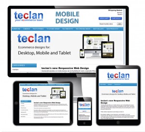
What is responsive web design?
“Responsive web design adapts the layout to the viewing environment by using fluid, proportion-based grids, flexible images, and CSS3 Media queries, an extension of the @media rule”
Eh?
In plain English – Your website will change how it displays on a desktop, tablet or mobile device depending on the width of the screen that it is being viewed in. One website, one design, multiple layouts across multiple devices.
Why responsive design? Well, Google recommends it for one thing!
 “(From Google) We recommend using responsive web design because it has many good aspects:
- Using a single URL for a piece of content makes it easier for your users to interact with, share, and link to your content, and a single URL for the content helps Google’s algorithms assign the indexing properties for the content.
- No redirection is needed for users to get to the device-optimized view, which reduces loading time. Also, user agent-based redirection is error-prone and can degrade your site’s user experience (see “Pitfalls when detecting user agents” section for details).
- It saves resources for both your site and Google’s crawlers. For responsive web design pages, any Googlebot user agents needs to crawl your pages once, as opposed to crawling multiple times with different user agents, to retrieve your content. This improvement in crawling efficiency can indirectly help Google index more of the site’s contents and keep it appropriately fresh.”
What benefits will a Responsive website bring me?
- You’ll only need one website – not two or three versions for different platforms
- Google will like you more (for the reasons above)
- Your website will (if correctly designed) be more usable to the growing mobile/tablet market
- You increase your chances of conversions to sale through mobile/tablet channels
- You’ll stay one step ahead of your competitors
- You only need one web address, one website to administer and one website to market
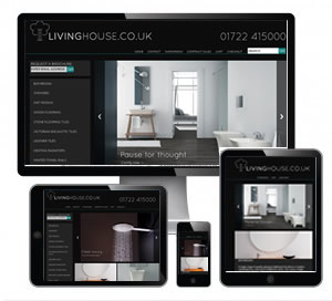
Examples
Important information
It’s worth noting that there is an anticipated growth of 50% in the mobile and tablet market for businesses in 2014!! That is a massive potential market to ensure you can deliver your website to.
Responsive web designs adapt to the screen width they are displayed within. NOT the device i.e. you are increasing your chances of future proofing your website
In Summary:
If you do not already have a responsively designed website, then make sure your next web design iteration is responsive. It could cost you business if you do not implement this latest web technology.
At present teclan is undertaking only responsive web design work, therefore if you want to book in your site to be redesigned into a responsive web design then please get in touch with the team asap to ensure a speedy turn around.
Call today on 01463 898043


