
What is Responsive Design?
Simply put a Responsive Design will change how your site displays on a desktop, tablet or mobile device depending on the width of the screen that it is being viewed in. One website, one design, multiple layouts across multiple devices.
Why does Google recommend Responsive Design?
“We recommend using responsive web design because it:
- Makes it easier for users to share and link to your content with a single URL.
- Helps Google’s algorithms accurately assign indexing properties to the page rather than needing to signal the existence of corresponding desktop/mobile pages.
- Requires less engineering time to maintain multiple pages for the same content.
- Reduces the possibility of the common mistakes that affect mobile sites.
- Requires no redirection for users to have a device-optimized view, which reduces load time. Also, user agent-based redirection is error-prone and can degrade your site’s user experience (see ‘Pitfalls when detecting user agents’ section for details).
- Saves resources when Googlebot crawls your site. For responsive web design pages, a single Googlebot user agent only needs to crawl your page once, rather than crawling multiple times with different Googlebot user agents to retrieve all versions of the content. This improvement in crawling efficiency can indirectly help Google index more of your site’s content and keep it appropriately fresh.”
What benefits will a Responsive Website bring me?
- You’ll only need one website – not two or three versions for different platforms.
- Google will like you more (for the reasons above).
- Your website will (if correctly designed) be more usable to the growing mobile/tablet market.
- You increase your chances of conversions to sale through mobile/tablet channels.
- You’ll stay one step ahead of your competitors.
- You only need one web address, one website to administer and one website to market.
- Described at the time as Mobilegeddon on the 21st April 2015 Google started showing preference to websites that are deemed “mobile friendly.”
You can test your site here to see if it is mobile friendly in Google’s eyes.
Examples of Responsive Designs undertaken by teclan

“teclan converted our old website into a responsive WordPress design, and then added in a number of advanced features that we didn’t have before. The new site makes it so much easier for us to manage the content ourselves and monitor incoming sales leads. This, combined with teclan’s ongoing SEO service has helped us grow our business. We recommend teclan to any online business wanting to reach the next level.”
Stephen Adams English Heritage Buildings
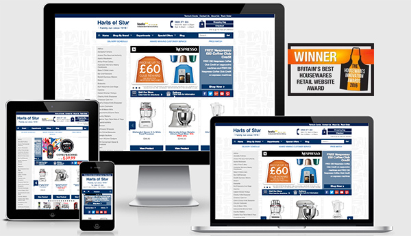
“We worked closely with teclan whose expertise helped us to deliver this world class, award winning, responsive website, to ensure that our company continues to offer the best experience for our online customers.”
Graham Hart, Director Harts of Stur Best Housewares Retail Website Award 2015-2016
teclan are award winning ecommerce Responsive Designers with over 100 years of combined ecommerce, marketing and retail experience. Contact us today on 01463 898 043 to discover how we can grow your business – our success is based on your success.